
Data Visualization System
Overview
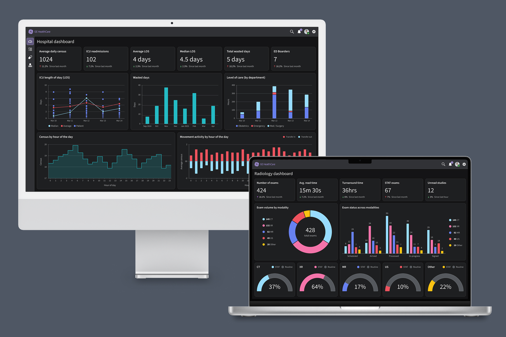
As GE HealthCare’s design system matured, one significant gap remained unresolved: data visualization. Many products relied on third-party charting libraries and created visualizations independently, resulting in inconsistent experiences, accessibility concerns, and a lack of shared guidance for teams designing dashboards, reports, and analytics experiences. Recognizing this need, I took ownership of establishing data visualization standards for the Ethos Design System. The resulting framework provided guidance for visual hierarchy, accessibility, color, chart composition, chart selection, and data storytelling.
My role
I led the creation of the data visualization standards, including research, framework development, accessibility guidance, chart selection models, color systems, documentation, and supporting adoption.
The challenge
Without clear standards, inconsistencies compounded over time. Teams relied on third-party charting libraries and individual approaches, leading to fragmented patterns, accessibility gaps, and inconsistent ways of communicating data across products.
Problem statement
In data-driven environments, visualizations must be clear and accessible. Without a shared framework, teams produced inconsistent patterns and misaligned data communication across products.
Building the framework
Data visualization color system
I developed a dedicated color framework specifically for data visualization. The system included categorical, sequential, and diverging palettes.
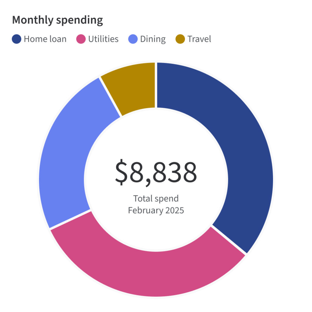
Categorical palettes separate data into distinct groups. 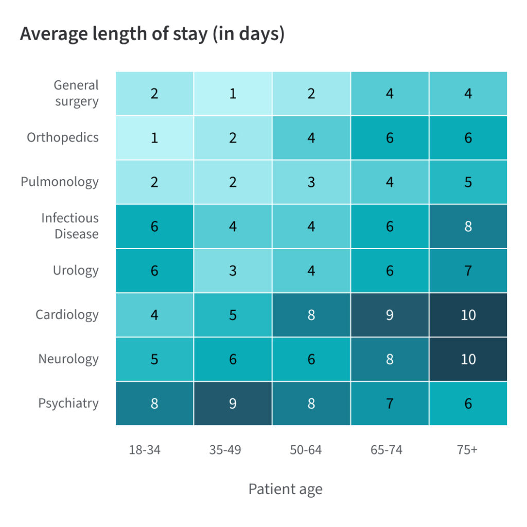
Sequential palettes show magnitude through a continuous gradient. 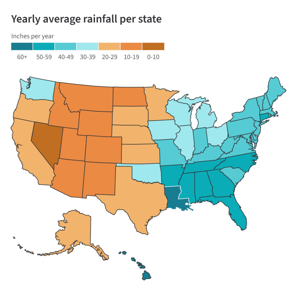
Diverging palettes highlight values above and below a midpoint.
Accessible color testing
Each palette was tested for perceptual clarity, accessibility, and usability. Supporting guidance outlines recommended color pairings, combinations to avoid, and contrast standards to help create effective and inclusive visualizations.
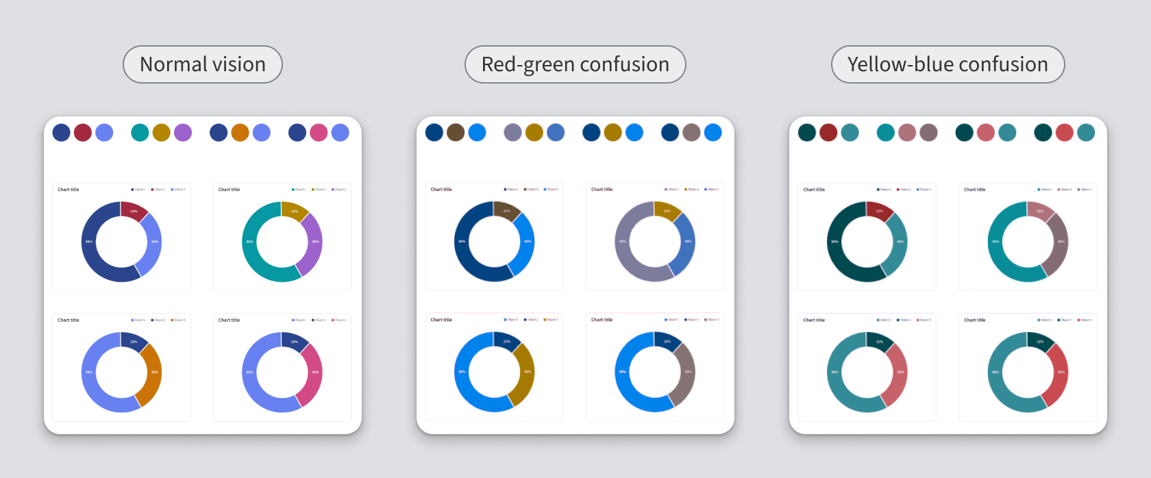
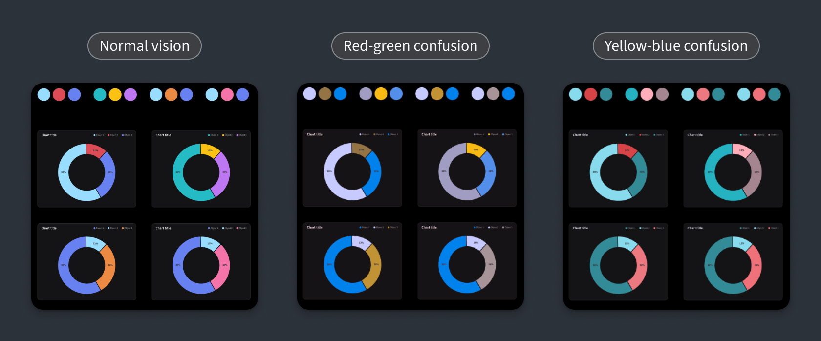
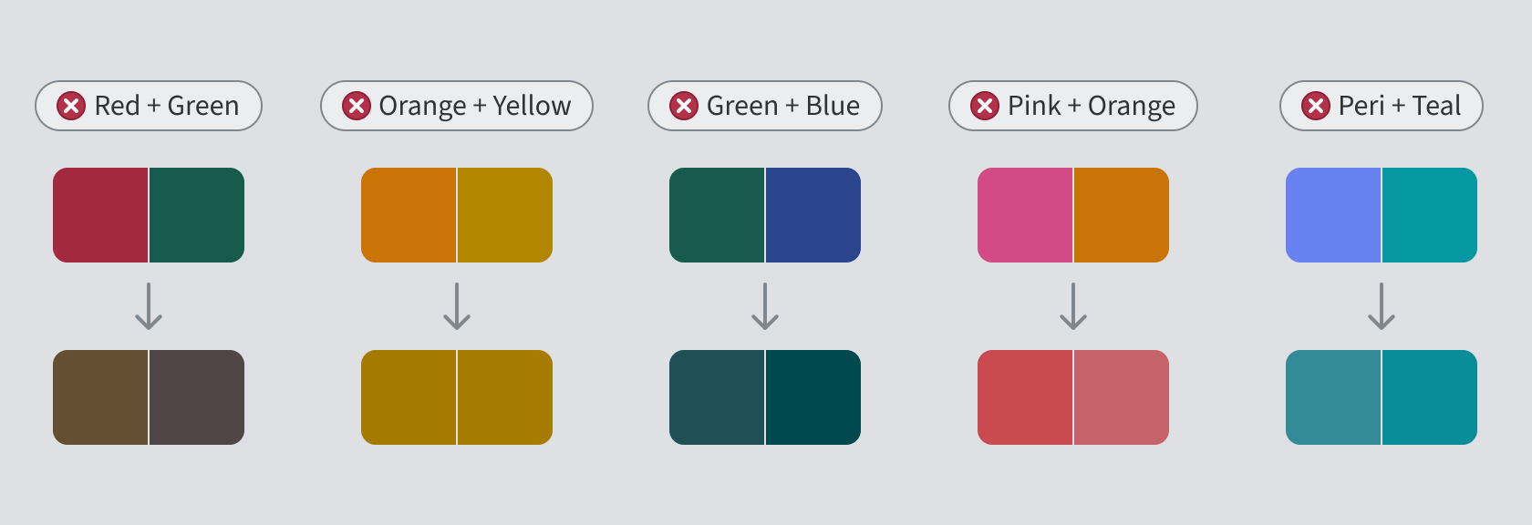
Documented accessible color pairings and color combinations to avoid.
Designing accessible visualizations
Accessibility extended beyond color selection to include patterns, shapes, and direct labeling. By combining multiple visual cues, the framework helps ensure data remains clear, distinguishable, and interpretable for diverse users.
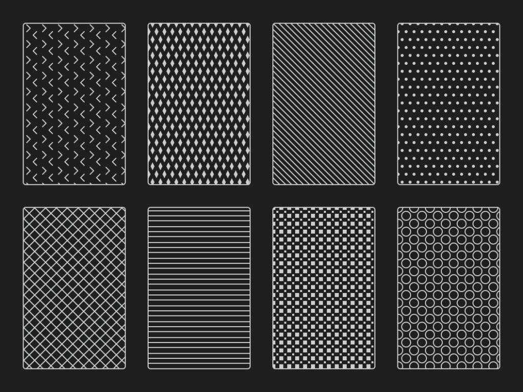
Patterns add distinction when color alone is insufficient. 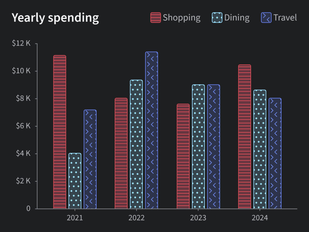
Patterns applied to a clustered column chart. 
Shapes reinforce category distinction across charts. 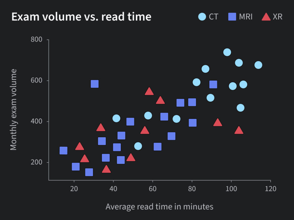
Shapes applied to a scatter plot. 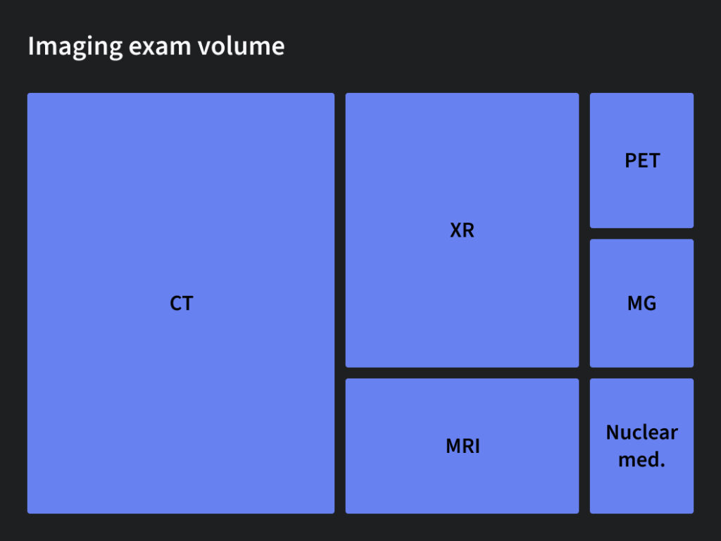
Direct labels identify segments without relying on a legend. 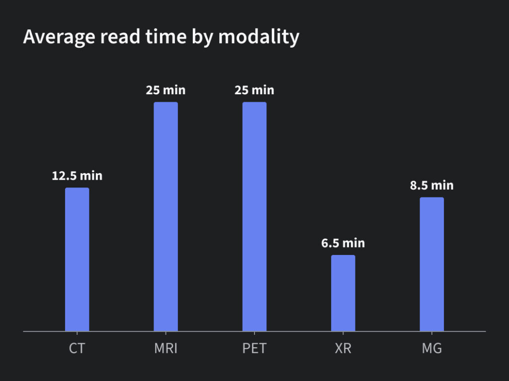
Direct labels place values near the data to improve readability.
Chart composition standards
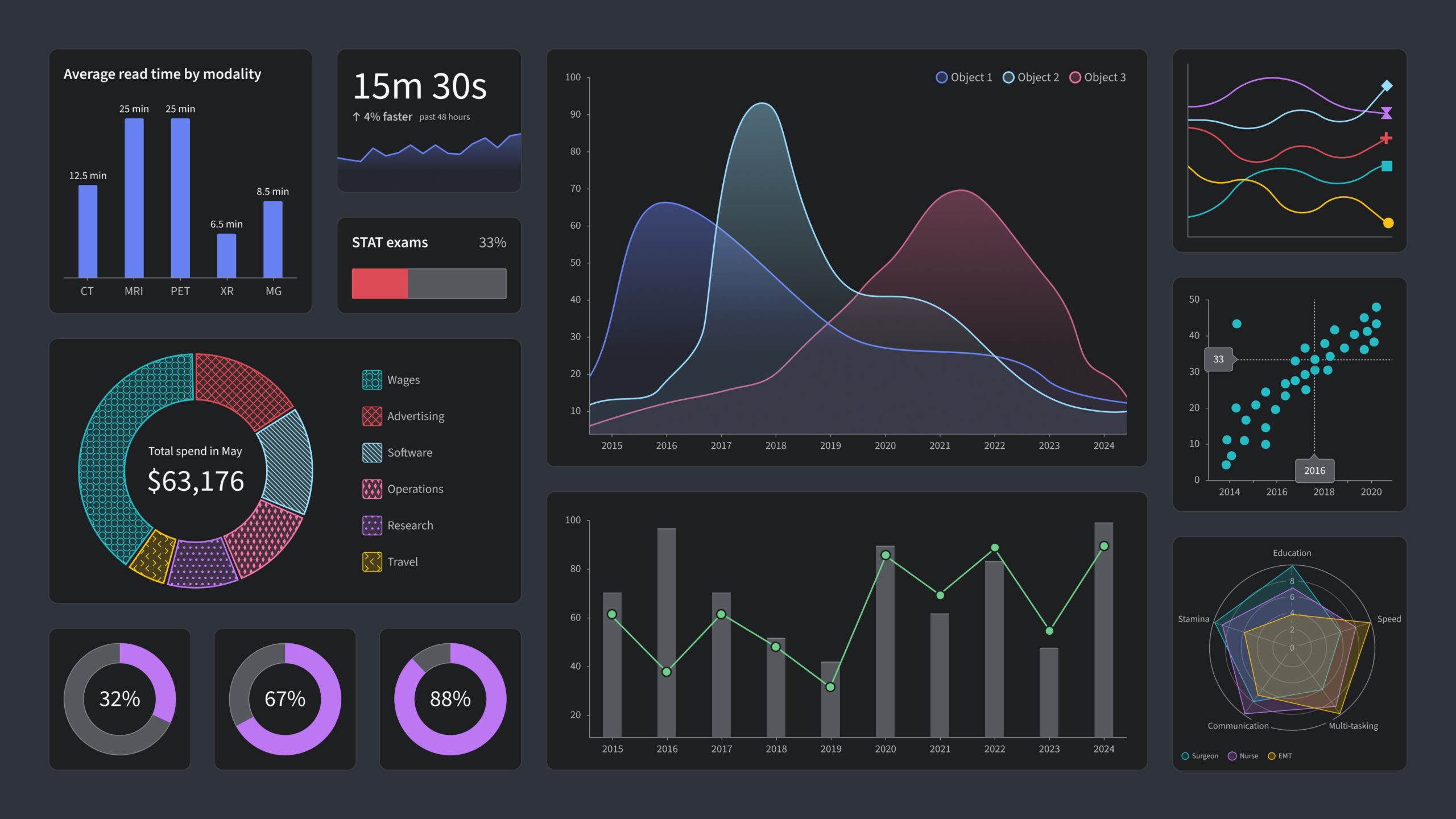
To improve consistency across products, I created detailed guidance covering chart layout and hierarchy. Standards included recommendations for titles, axes, legends, labels, typography, spacing, tooltips, and responsive behavior. The goal was to help teams create visualizations that were easier to scan, interpret, and compare across applications.
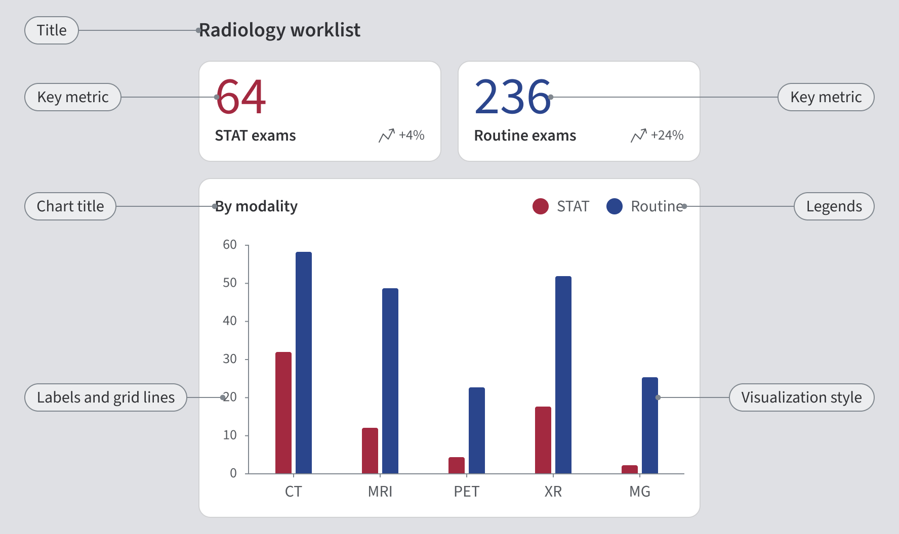
Chart selection guidelines
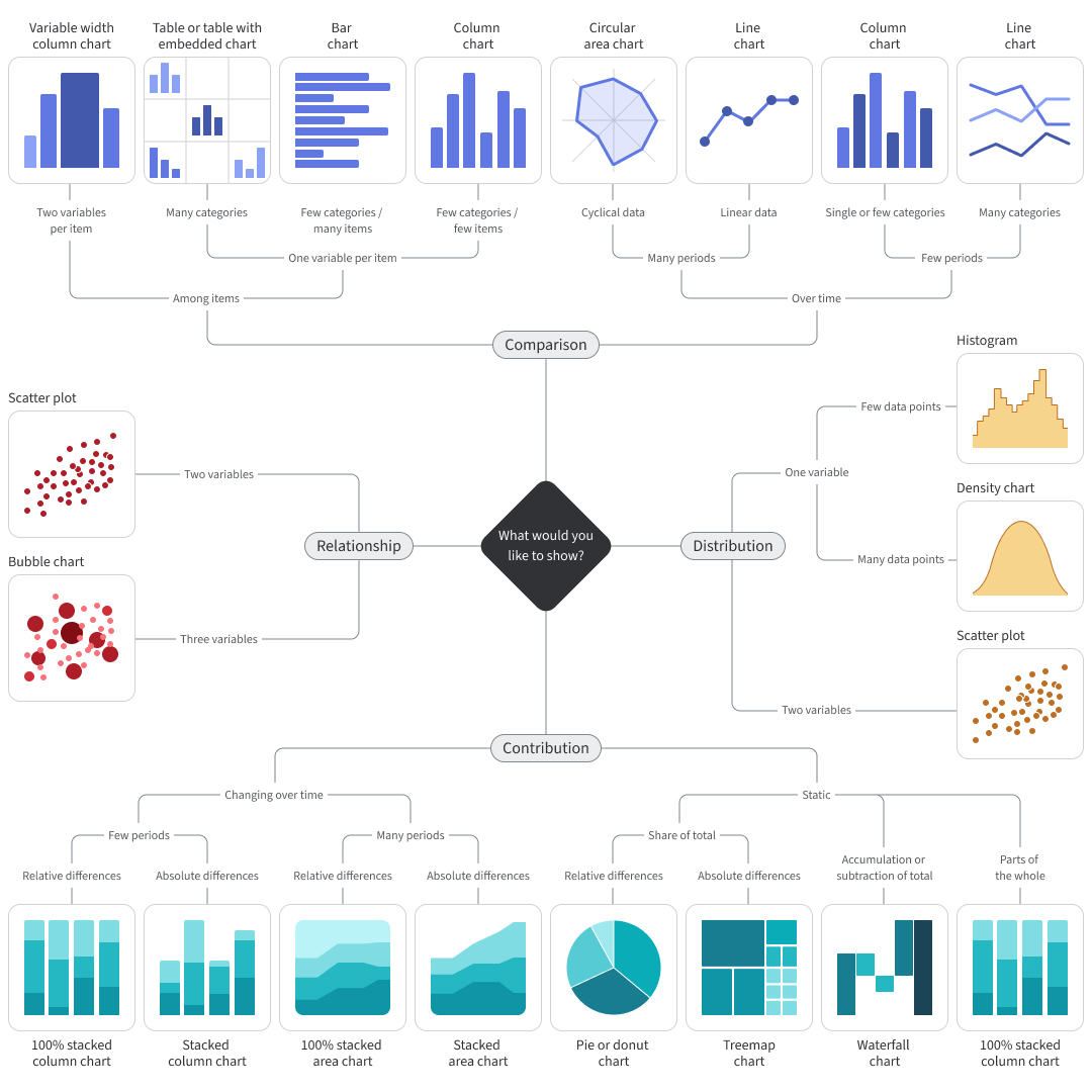
Following established best practices, I created a chart selection framework that mapped visualization types to user goals and analytical tasks. The guidance was organized around user intent, helping teams choose charts based on the question they needed to answer rather than personal preference.
Building expertise
Before creating standards, I wanted to ensure our standards were grounded in established research rather than personal opinion. I completed coursework, studied industry leaders, and explored topics including human perception, cognitive load reduction, accessibility, information hierarchy, and data storytelling. This research became the foundation for every guideline that followed.
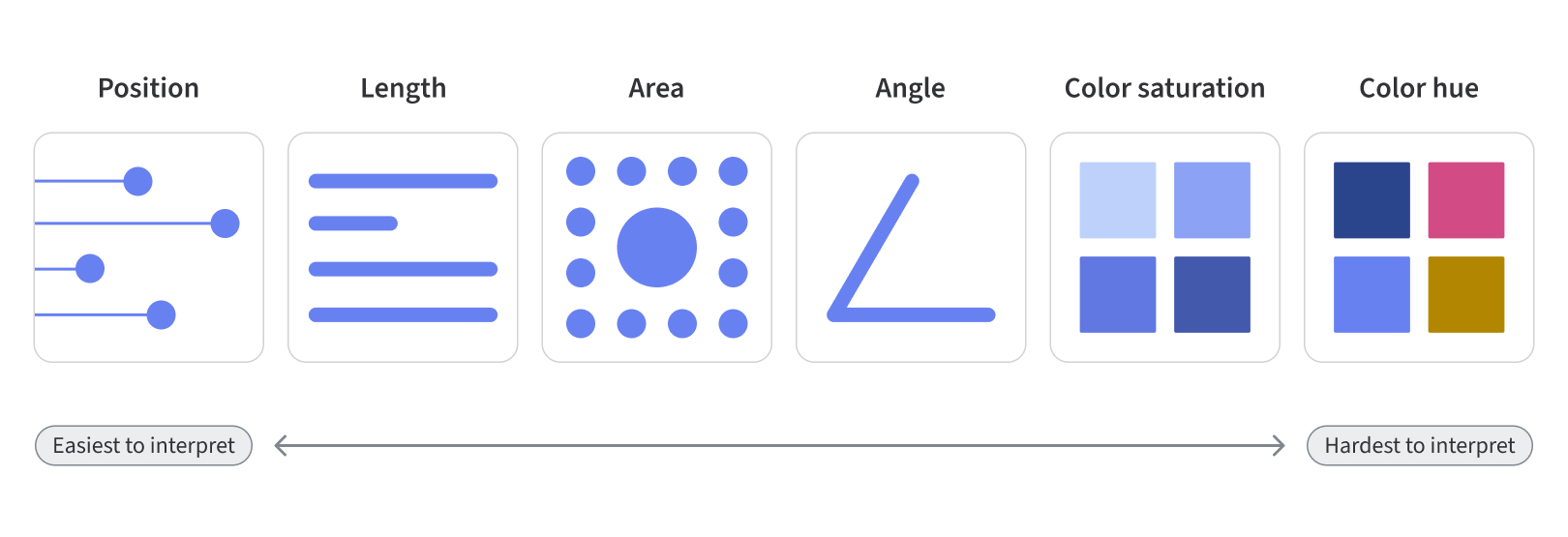
Research-informed hierarchy for chart design
Results
The framework established a shared approach to data visualization, helping teams create more consistent, accessible, and effective visualizations. As my expertise grew, I also became responsible for communicating the impact of the Ethos Design System. I partnered with leadership to create dashboards, metrics, and executive presentations that translated complex organizational data into clear, compelling stories. This work made adoption, impact, cost savings, and risk visible and directly informed decision-making around hiring, resourcing, and long-term strategy.
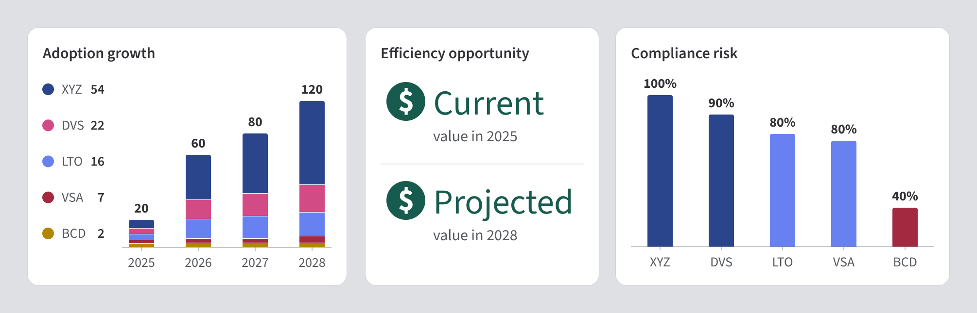
Translating design system data into leadership metrics (anonymized conceptual example).
Impact

Consistency
Created a shared framework for consistent and effective data visualization across products.

Accessible communication
Made data easier to understand through accessibility and cognitive design principles.

Strategic influence
Used data storytelling to help leadership communicate impact and guide strategic decisions.