4moms Packaging
Overview
4moms’ expanding product line required a scalable packaging system that maintained strong brand recognition across new products and accessories. The work extended the brand into new categories, ensuring consistency across physical packaging and digital presentation, with clarity, cohesion, and flexibility to support ongoing product launches.
My role
Led the extension of the packaging system, developed color strategies to differentiate product families and support launch sequencing, and designed accessory packaging to align with parent products.
The challenge
Problem statement
Extending the brand across 7+ new products required cohesive packaging and accessory designs that aligned with parent products, while maintaining 4moms’ bold, jewel-tone look and strong market recognition.
Design objectives
- Maintain a clear, consistent brand presence across shelf, online, and in-store channels
- Create a scalable packaging system for new products and accessory lines
- Establish a logical color system to differentiate product families and options
- Ensure accessory packaging aligns with parent products
- Support ongoing brand growth with a flexible, cohesive framework
Process
Updating brand consistency
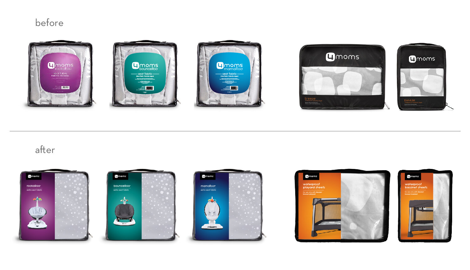
The packaging template was updated with the black-and-white logo to reinforce 4moms’ signature look, boost recognition, and ensure visibility. This served as a minor but impactful first step in the redesign.
Before: Logo in white applied directly on the background, inconsistently placed. 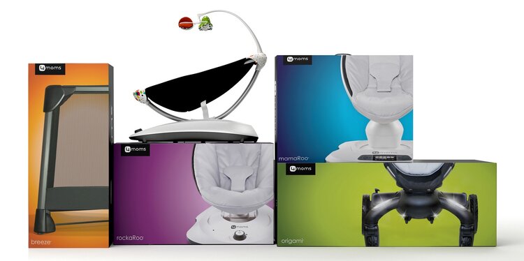
After: Logo and product name consistently applied, reinforcing brand identity.
Design exploration
Applying color strategically to support both brand recognition and product differentiation became essential, with seven new products planned over the next two years. To determine the most effective system for scaling the brand, two distinct approaches were explored.
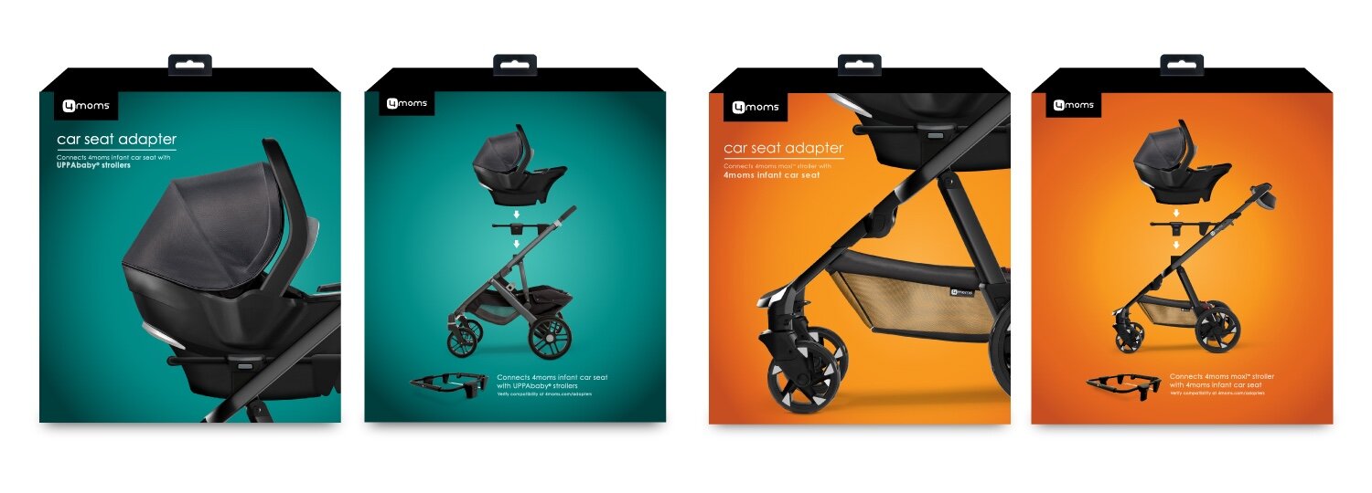
Option 1 • The first approach assigned a unique color to each new product, maximizing differentiation but increasing complexity across the system.
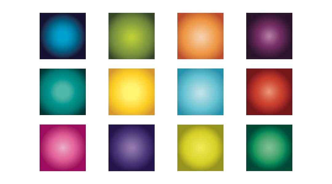
Option 1: Color options using one unique color for each product. 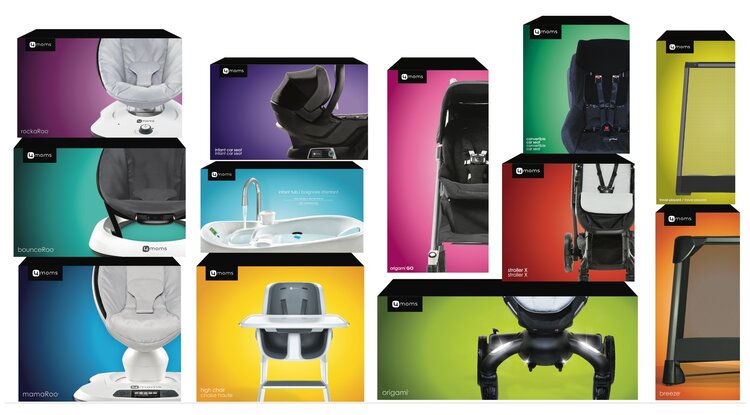
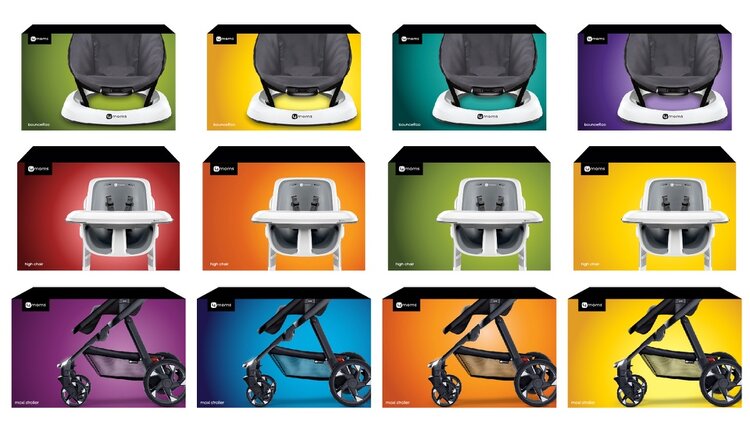
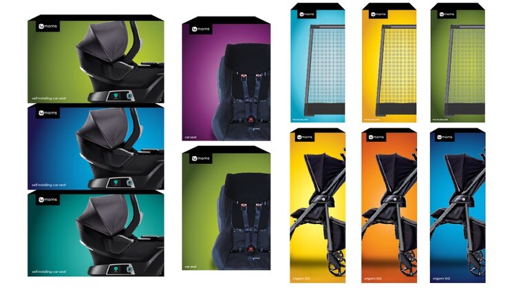
Option 1: Colors applied to packaging line.
Option 2 • The second expanded the existing palette and then reused colors across products, reinforcing cohesion while keeping the system scalable.
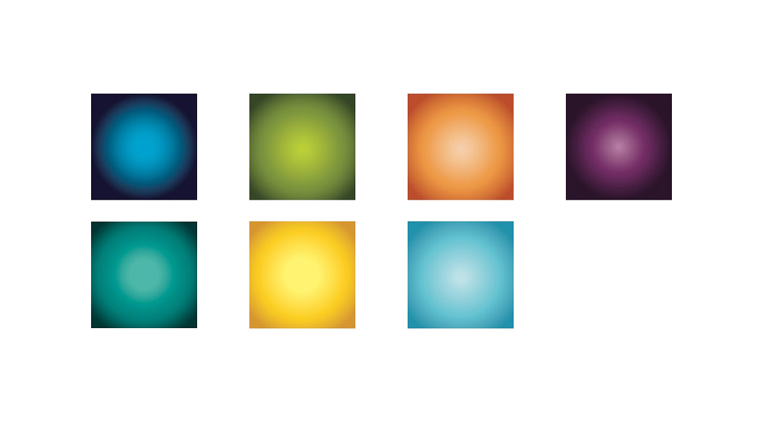
Option 2: Expanded existing color palette. 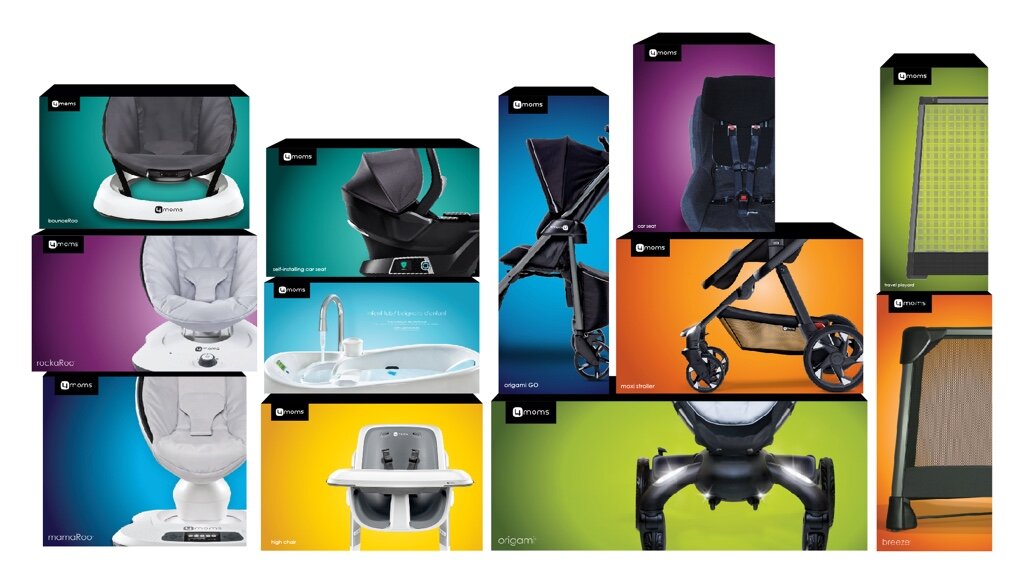
Option 2: Colors applied strategically to packaging.
Conclusion
It became clear that assigning a new color to each product didn’t scale well for a growing brand. Since the jewel tones were a defining element of the brand strategy, a system for reusing existing colors in a logical, consistent way was established.
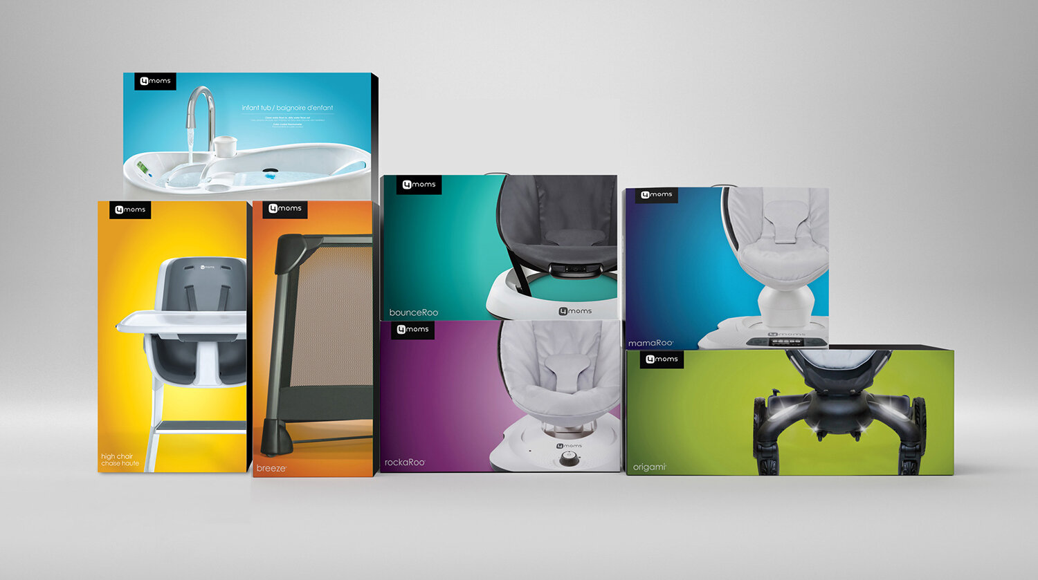
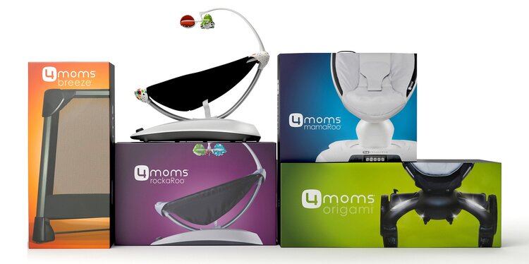
Final designs
Color consideration and guidelines
Guidelines were established to define how color should be used. Within each product category, distinct colors were essential to differentiate options and help customers match corresponding accessories both in-store and online.
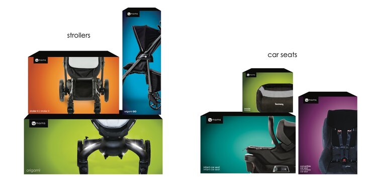
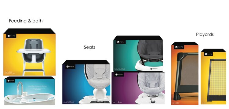
Because new products were featured across the website, social media, and in-store displays, color releases were staggered to avoid visual competition.
A final round of color exploration, incorporating these considerations, was conducted before selecting the final designs.
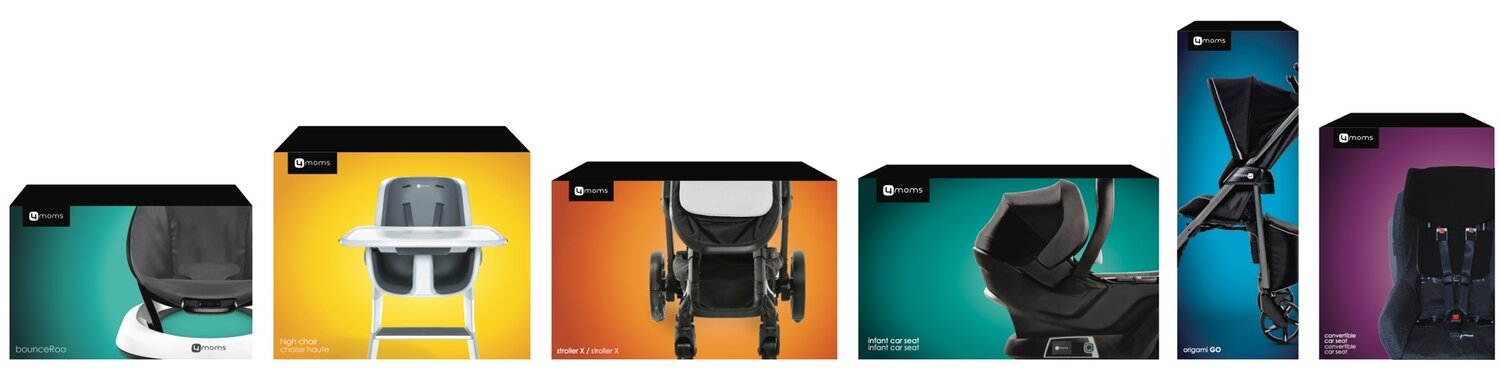
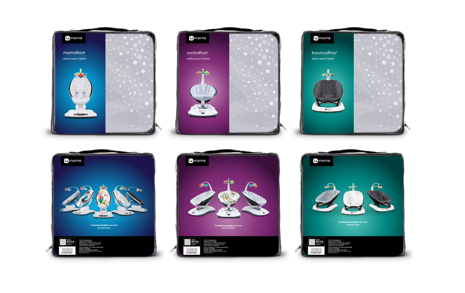
Final colors were applied to packaging mock-ups, with a documented system for future launches.
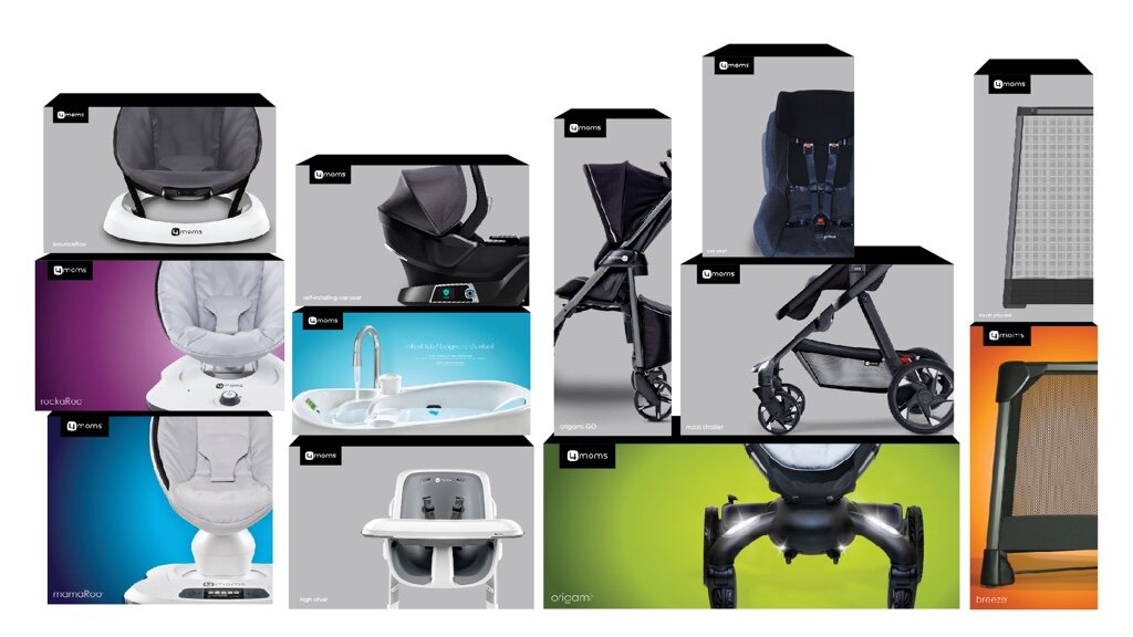
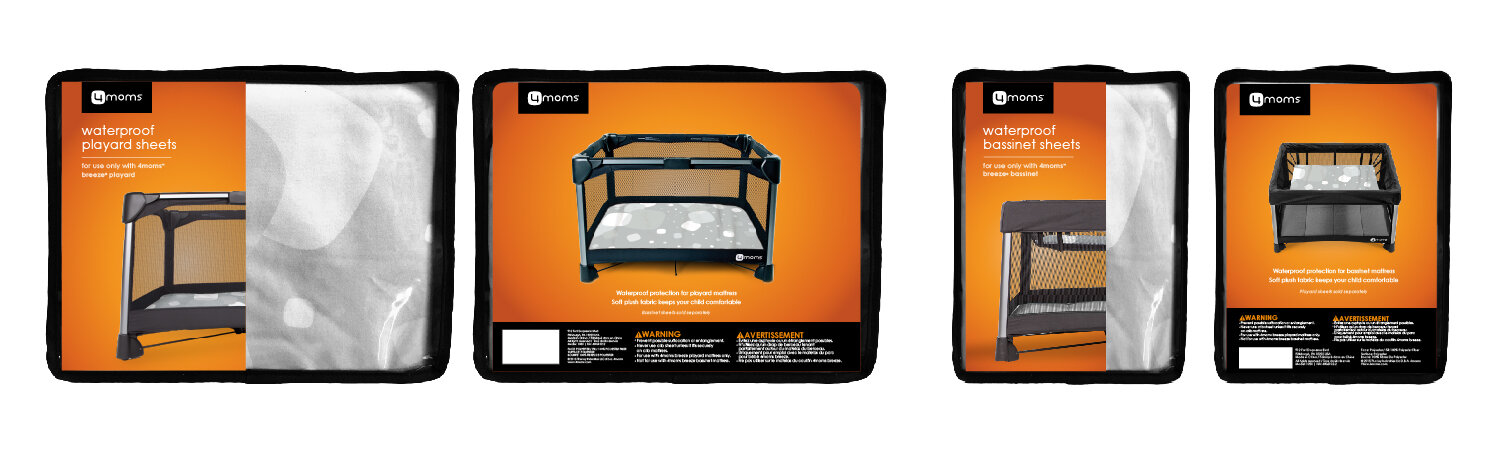
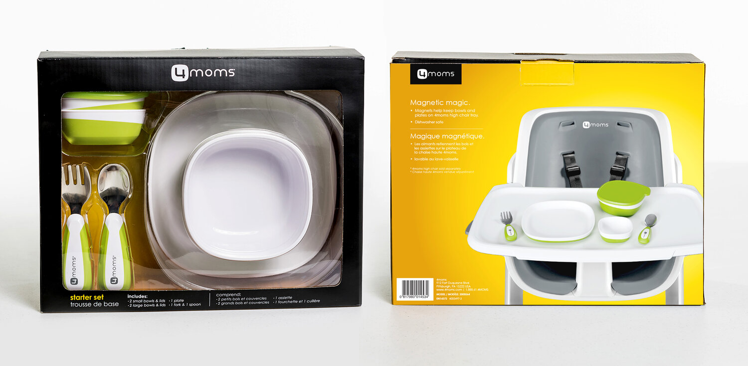
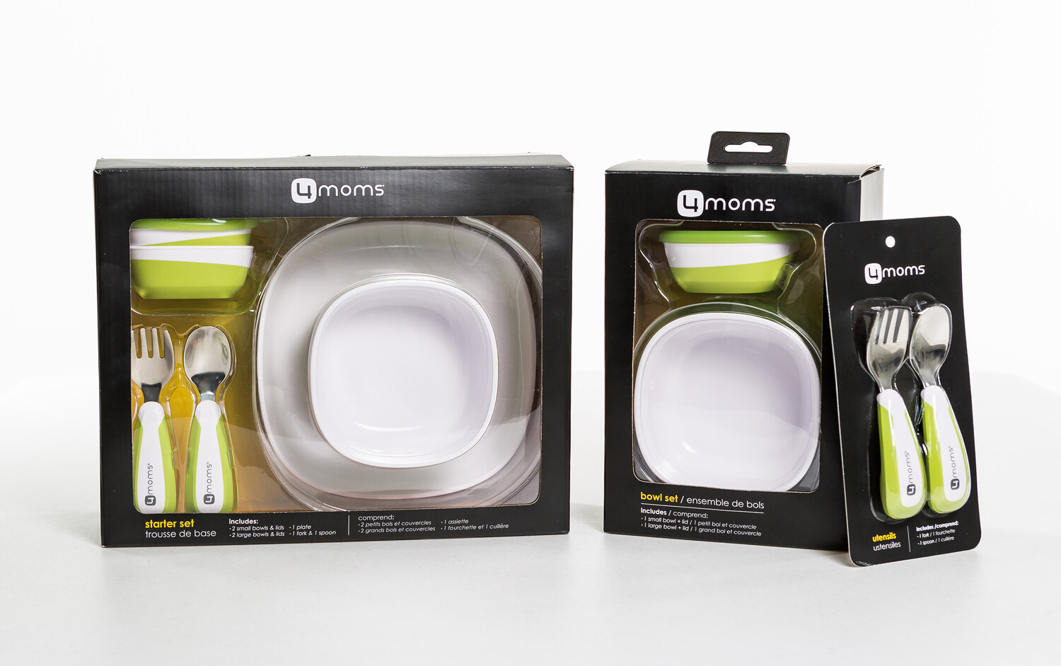
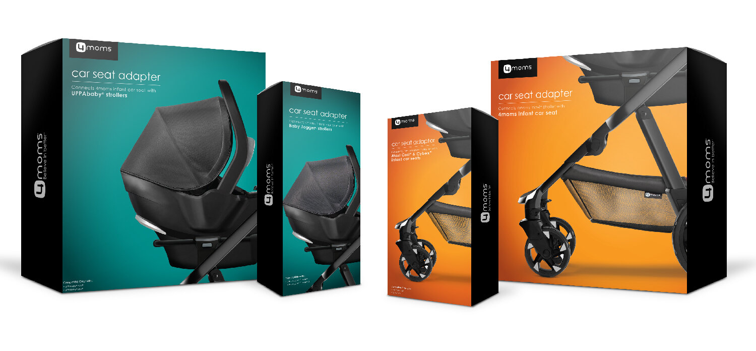
Accessory packaging
Accessory packaging was updated to mirror parent products, maintaining consistency across the line.
Solution
A cohesive, scalable packaging system that extends 4moms’ bold brand identity to new products and accessories, using consistent logos, jewel-tone color logic, and structured templates that work across channels.
Impact
Brand cohesion
New products and accessories align visually, strengthening brand recognition.
Scalability
The color system supports scalable, coordinated future product launches.
Customer clarity
Distinct product and category colors improve in-store and online selection for customers.