Imaging Annotations
Overview
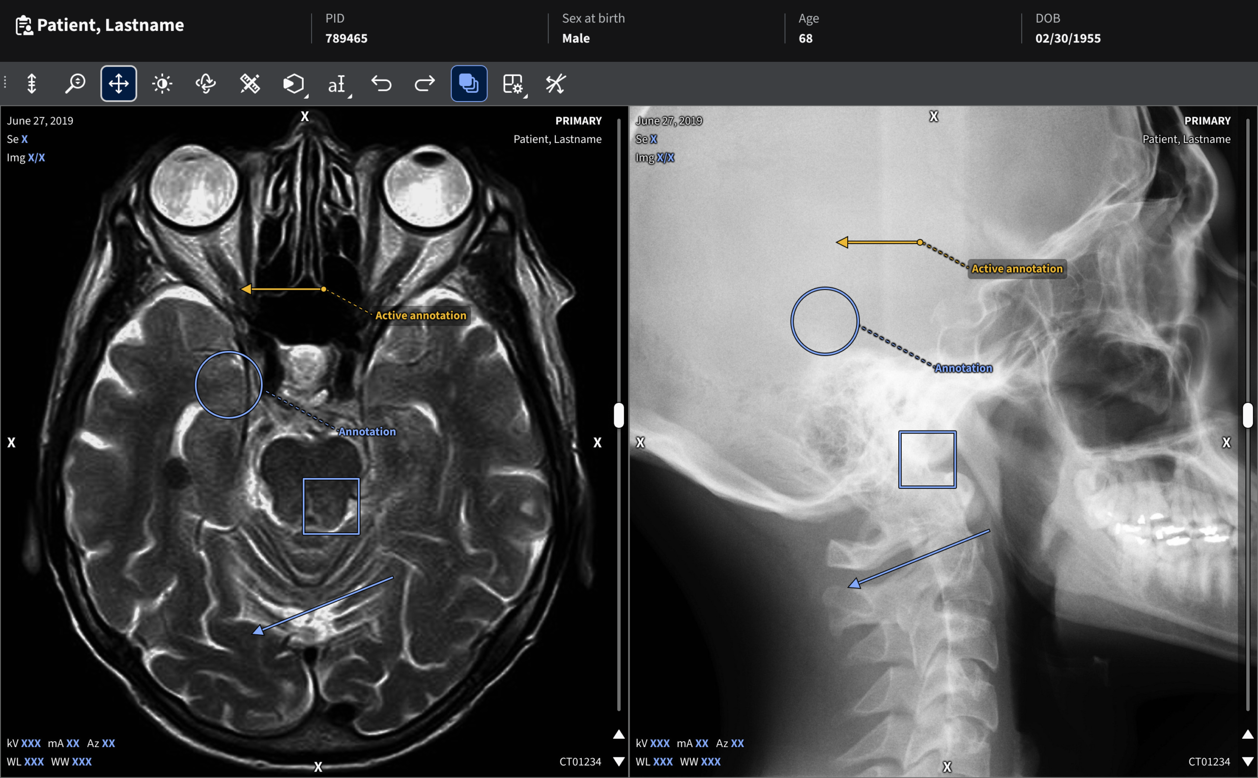
This project focused on creating a standardized visual and interaction system for medical imaging annotations and overlays used by radiologists across a range of applications. The work established consistent styles, behaviors, and interaction patterns for measurements, labels, and controls to ensure clarity without obscuring critical clinical findings.
My role
Led the creation of a standardized style guide for imaging annotations, optimizing interaction design while maintaining legibility across complex imaging backgrounds.
The challenge
Problem statement
Radiologists rely on annotations and measurements to evaluate and report findings. These annotations must be subtle yet legible, easy to manipulate, readable across diverse image backgrounds, and consistent across products and users to support trust and predictable interaction.
User needs and pain points
- Clear, legible measurements without blocking findings
- Precise and intuitive interactions
- Consistent behavior across tools and products
- Confidence that annotations would read clearly on diverse image backgrounds
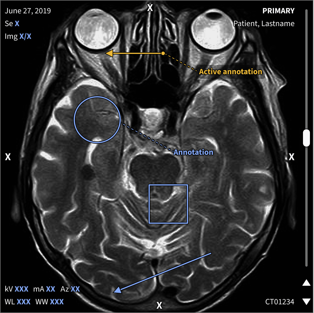
Imaging annotations seen on predominately darker grayscale 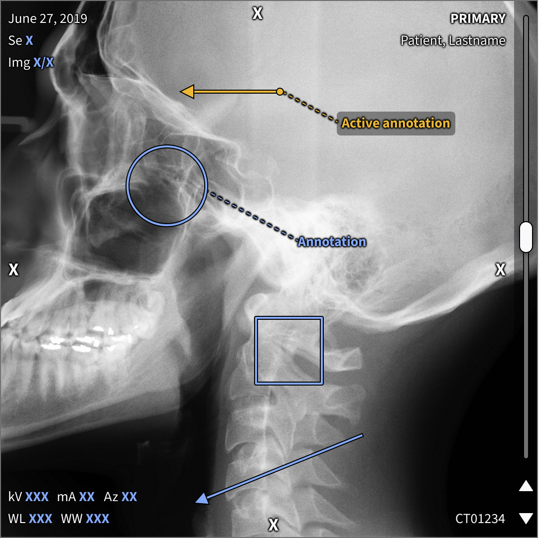
Imaging annotations seen on predominately lighter grayscale
Project goals
The goal was to create a cohesive annotation system that improved usability without increasing visual noise.
- Standardize visual styles for annotations and overlays
- Optimize interactions for precision and ease
- Ensure legibility across diverse imaging backgrounds
- Maintain minimal obstruction of clinical content
- Enable consistent implementation across products
Process
Understand
The existing solution was dated, inconsistent, and failed to maintain legibility across various imaging backgrounds. With no control over where measurements or text may appear, it was essential to create styles that perform well across a wide range of values and visually complex areas. Incorporating WCAG contrast principles helped ensure the system remained both accessible and usable.
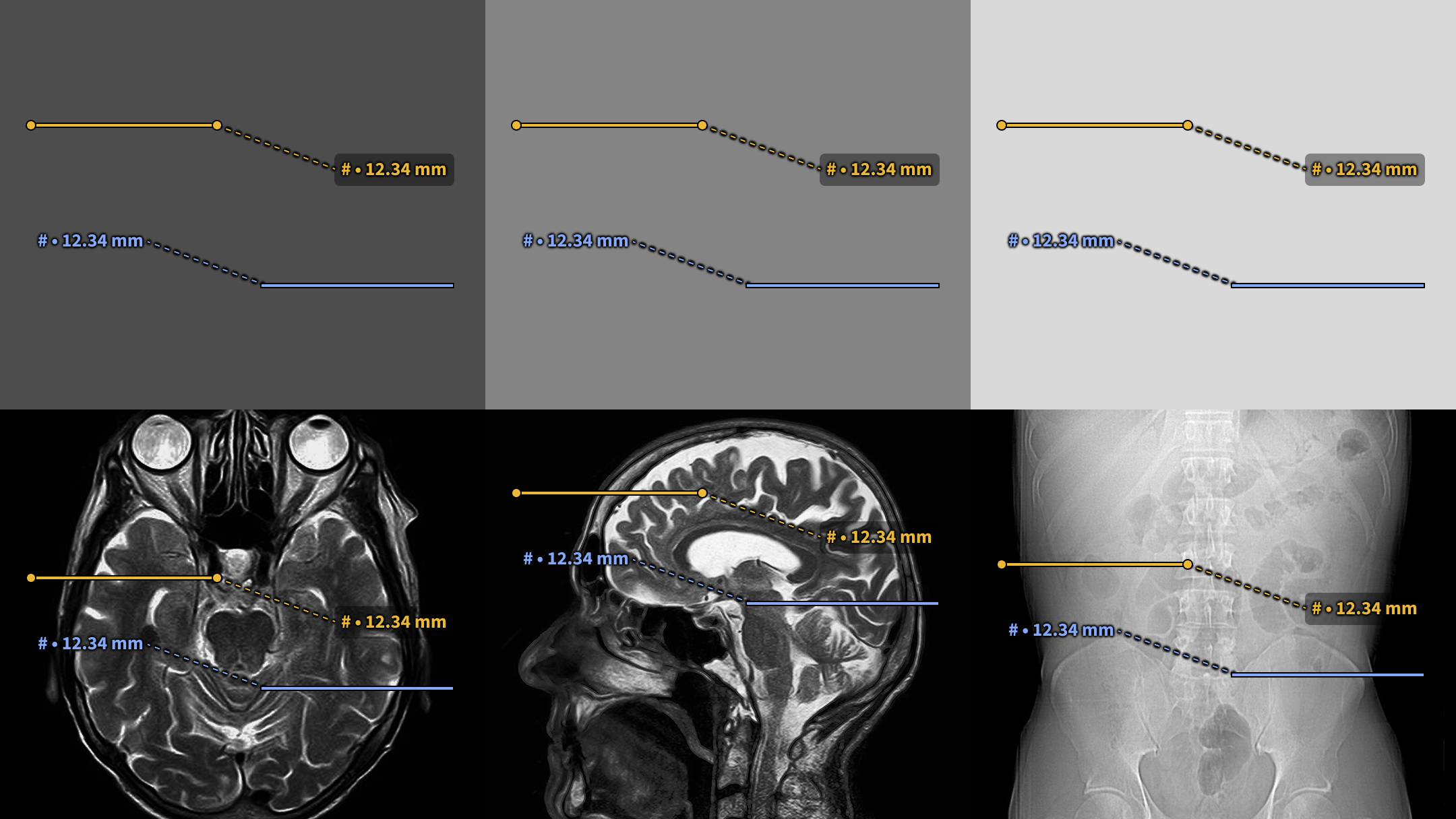
Existing solution lacked consistency 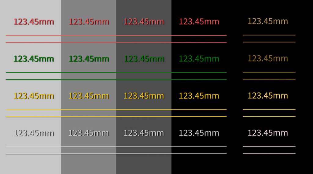
Existing colors created contrast failures and red–green confusion.
Design exploration
Design exploration focused on establishing consistency and improving legibility. Because annotation placement can vary, styles were developed to maintain sufficient contrast across a wide range of values and backgrounds.
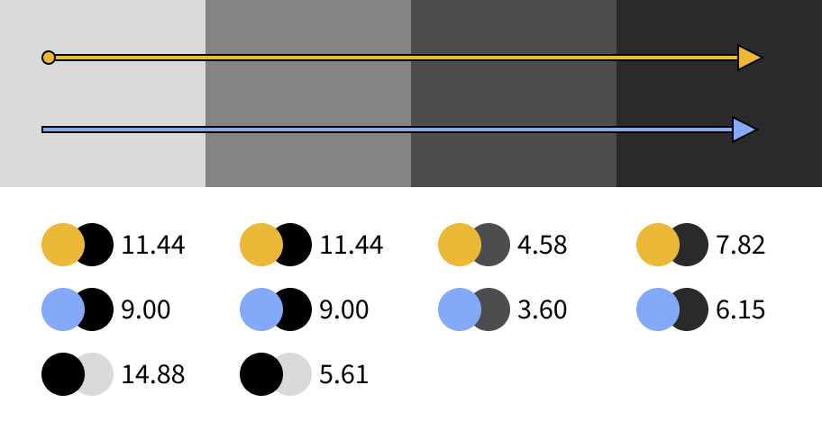
Color accessibility
Accessibility was evaluated to ensure annotations remain readable regardless of the underlying image. Color and subtle visual cues distinguish states, with palettes selected to remain accessible for users with common color vision deficiencies.
Black offsets paired with bright, high-contrast colors ensure legibility across varied background values. 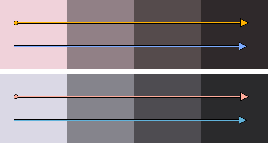
In red–green (top) and yellow–blue (bottom) color simulations, hues remain clearly distinguishable.
Final designs
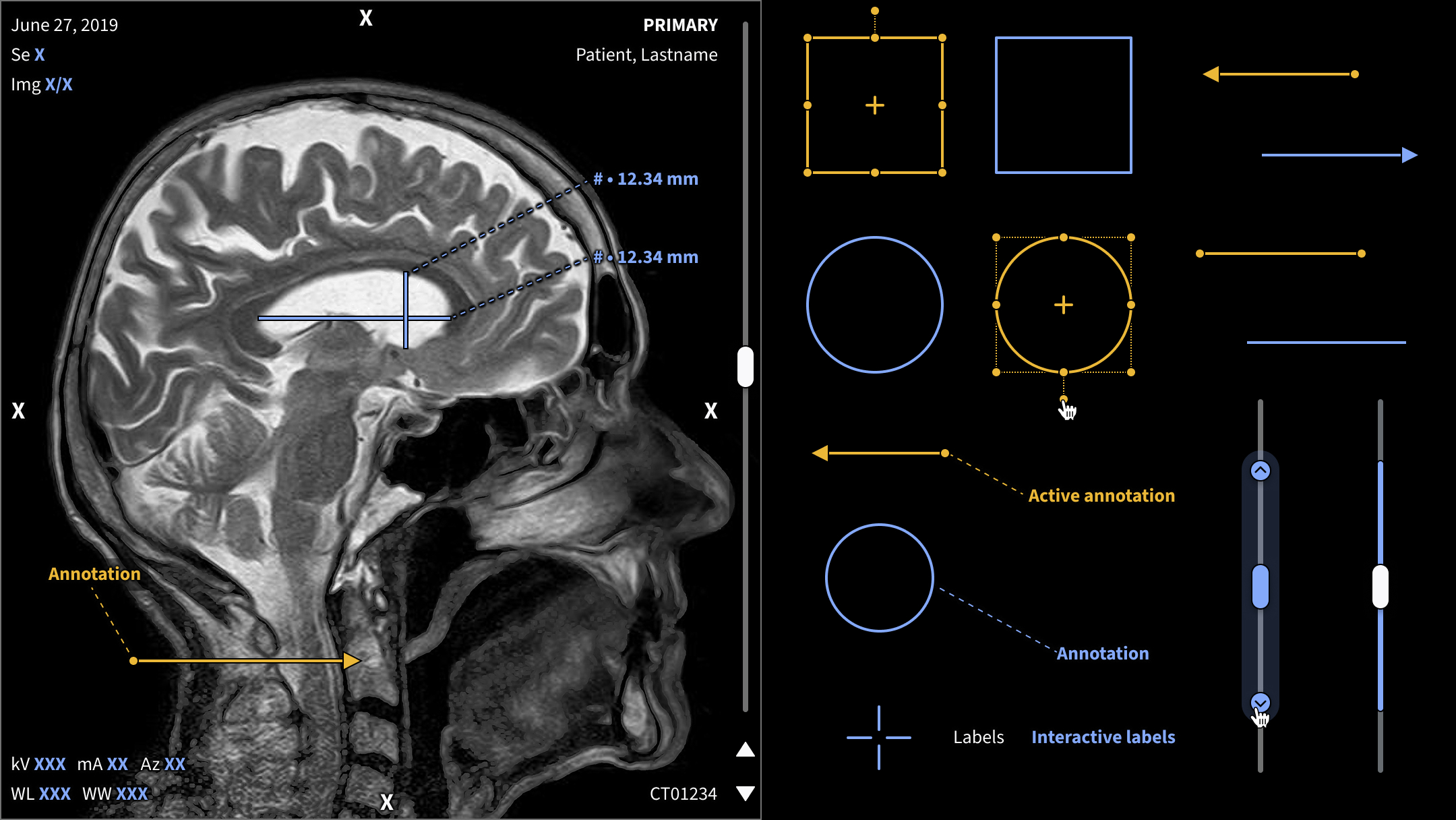
Cohesive visual language
A unified annotation style was created across line styles, text labels, and states to improve recognition and usability. One consistent action color connected interactive elements across viewports, reinforcing predictability and reducing cognitive load.
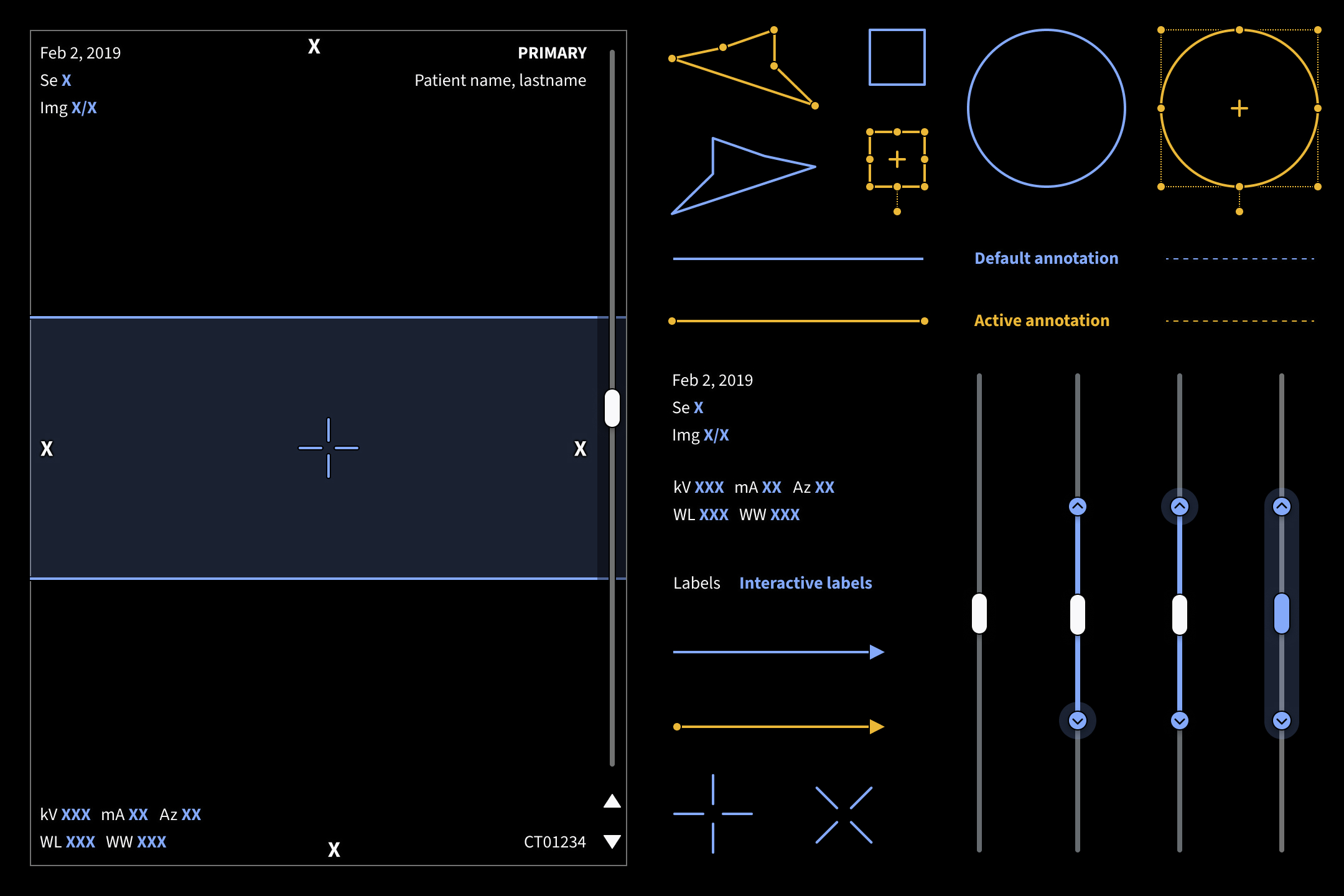
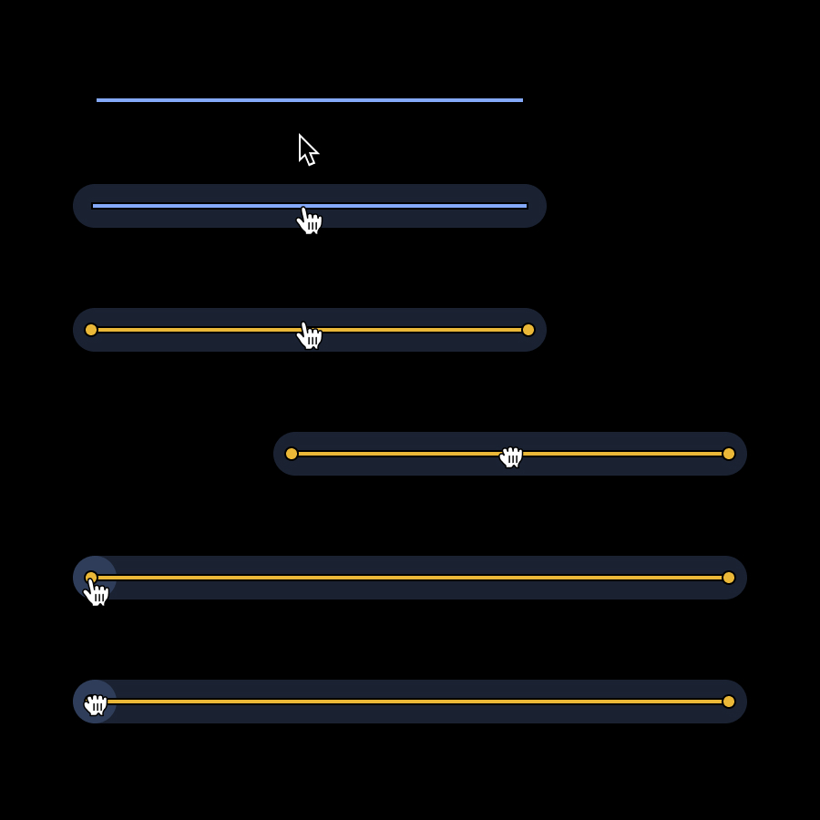
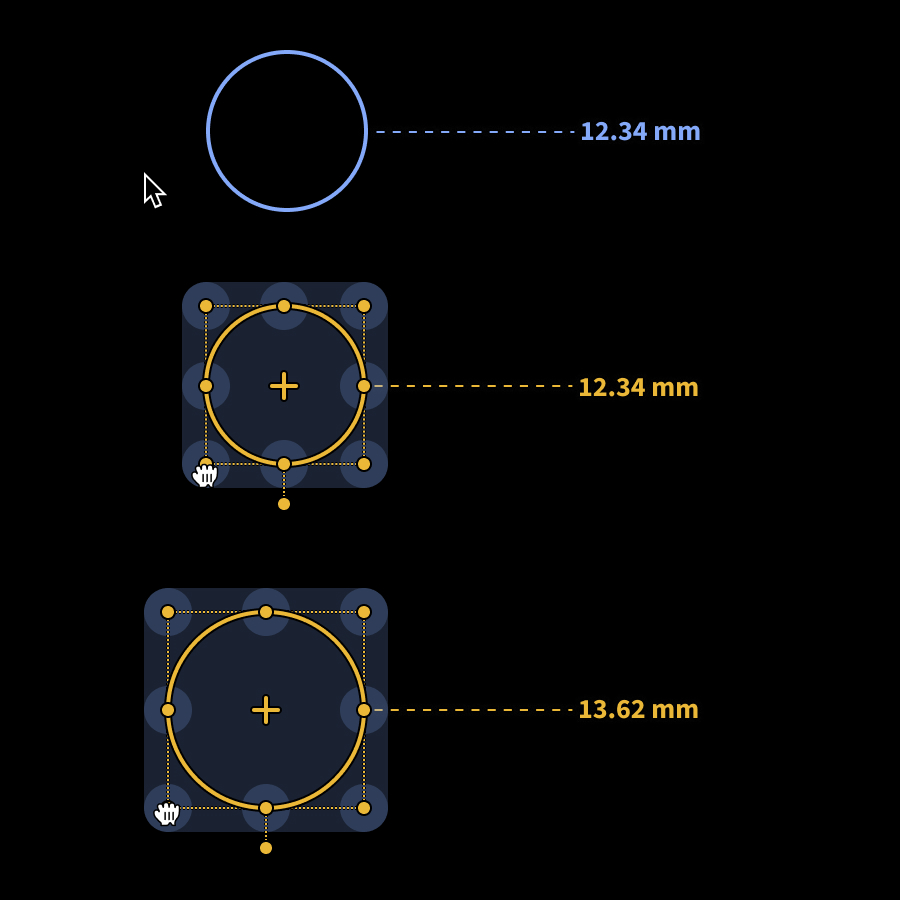
Interaction design
Hit targets were intentionally larger than the visual annotations themselves to keep overlays visually minimal while making them easy to manipulate.
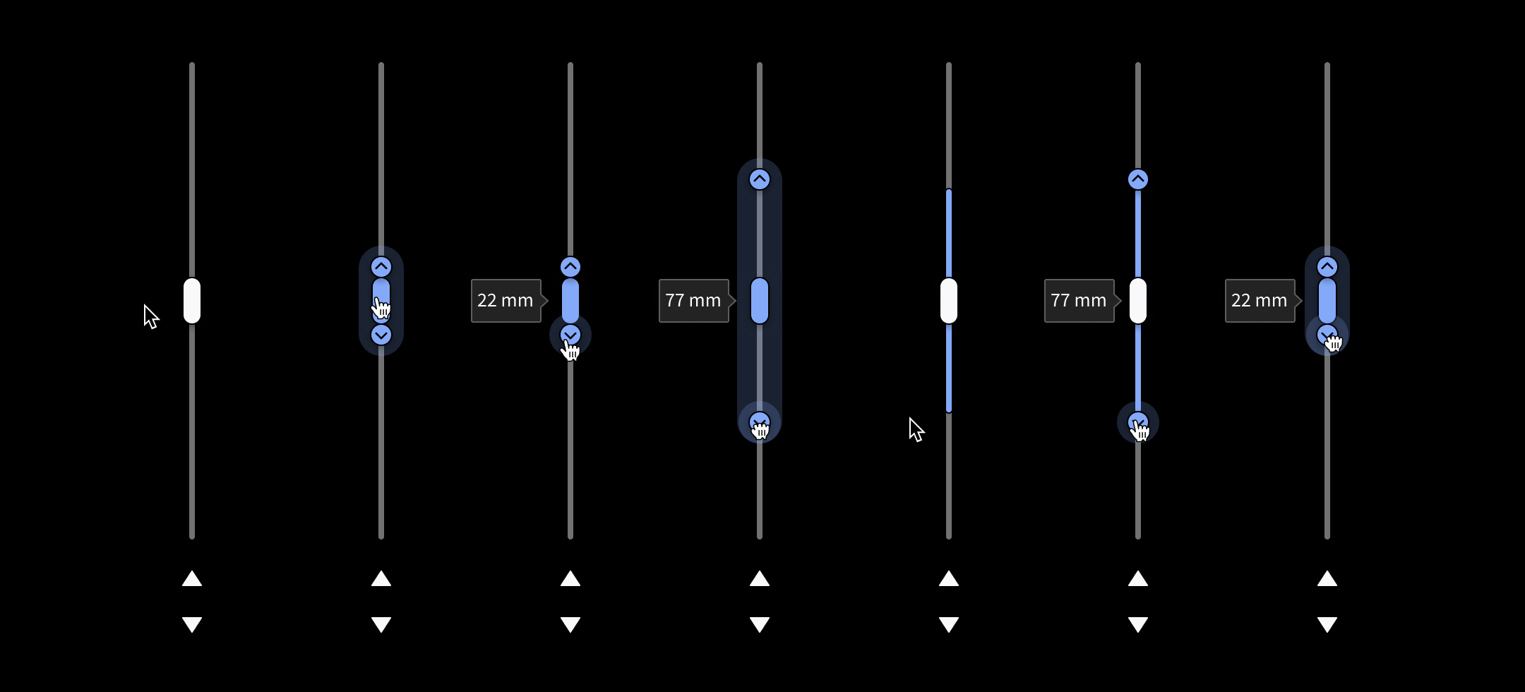
Custom scrollbar interactions were created to support precise control of slice‑thickness adjustments, an important element of radiology imaging workflows.
Solution
A standardized imaging annotation system that enables precise, readable, and minimally intrusive overlays through consistent visual styles and interaction patterns. The system balances subtlety with usability, supporting diagnostic accuracy and collaboration.
Impact
Scalability and consistency
Consuming applications were able to implement annotation patterns more quickly and consistently.
Improved usability
Radiologists benefited from predictable interactions and clearer overlays across products.
Global reach
Enabled rapid implementation of tools used for COVID-19 diagnosis and assessment.